Simple Water Wave Effect in HTML
Hello !
Welcome back, with me the founder of Syiainfoku. You will learn together on the Syiainfoku blog how to make a Simple Water Wave Effect
Ok, let's get started.
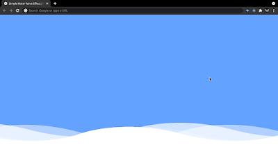
Preview Simple Water Wave Effect
More or less the result will be like in the picture above
Source Code and Brief Explanation
To make this program [Simple Water Wave Effect]. First you need to create two Files, one HTML File and one CSS File. After creating these files, just paste the following code into your file. You can also download the source code file of this Simple Water Wave Effect in HTML from the given download button.
First, create an HTML file with the name index.html and paste the given code in your HTML file. Remember, you must create a file with an .html extension.
<!DOCTYPE html>
<html lang="en">

<head>
    <meta charset="UTF-8">
    <meta http-equiv="X-UA-Compatible" content="IE=edge">
    <meta name="viewport" content="width=device-width, initial-scale=1.0">
    <title>Simple Water Wave Effect | hitoricoding</title>
    <link rel="stylesheet" href="./assets/style.css">
</head>

<body>
    <section>
        <div class="wave wave1"></div>
        <div class="wave wave2"></div>
        <div class="wave wave3"></div>
        <div class="wave wave4"></div>
    </section>
</body>

</html>
Finally, create a CSS file with the name style.css and paste the given code in your CSS file. Remember, you must create a file with a .css extension.
* {
    margin: 0;
    padding: 0;
    box-sizing: border-box;
}

section {
    position: relative;
    width: 100%;
    height: 100vh;
    background-color: #64a2ff;
    overflow: hidden;
}

section .wave {
    position: absolute;
    bottom: 0;
    left: 0;
    width: 100%;
    height: 100px;
    background: url(./wave.png);
    background-size: 1000px 100px;
}

section .wave.wave1 {
    animation: waveAnimate 30s linear infinite;
    z-index: 1000;
    opacity: 1;
    animation-delay: 0s;
    bottom: 0;
}

section .wave.wave2 {
    animation: waveAnimate2 15s linear infinite;
    z-index: 999;
    opacity: 0.5;
    animation-delay: -5s;
    bottom: 10px;
}

section .wave.wave3 {
    animation: waveAnimate 30s linear infinite;
    z-index: 998;
    opacity: 0.2;
    animation-delay: -2s;
    bottom: 15;
}

section .wave.wave4 {
    animation: waveAnimate2 5s linear infinite;
    z-index: 997;
    opacity: 0.7;
    animation-delay: -5s;
    bottom: 20px;
}

@keyframes waveAnimate {
    0% {
        background-position-x: 0;
    }

    100% {
        background-position-x: 1000px;
    }
}

@keyframes waveAnimate2 {
    0% {
        background-position-x: 0;
    }

    100% {
        background-position-x: -1000px;
    }
}
That's it, now you have successfully created a Simple Water Wave Effect in HTML, If your code is not working or you are facing any error/problem, please download the source code file from the given download button. It's free and a .zip file will be downloaded then you have to extract it.
Closing
Thank you for those of you who have read and downloaded this source code, hopefully it can be useful and add to your insight.
If you found this article useful, you can share it. That's all from me, and THANK YOU


Post a Comment